



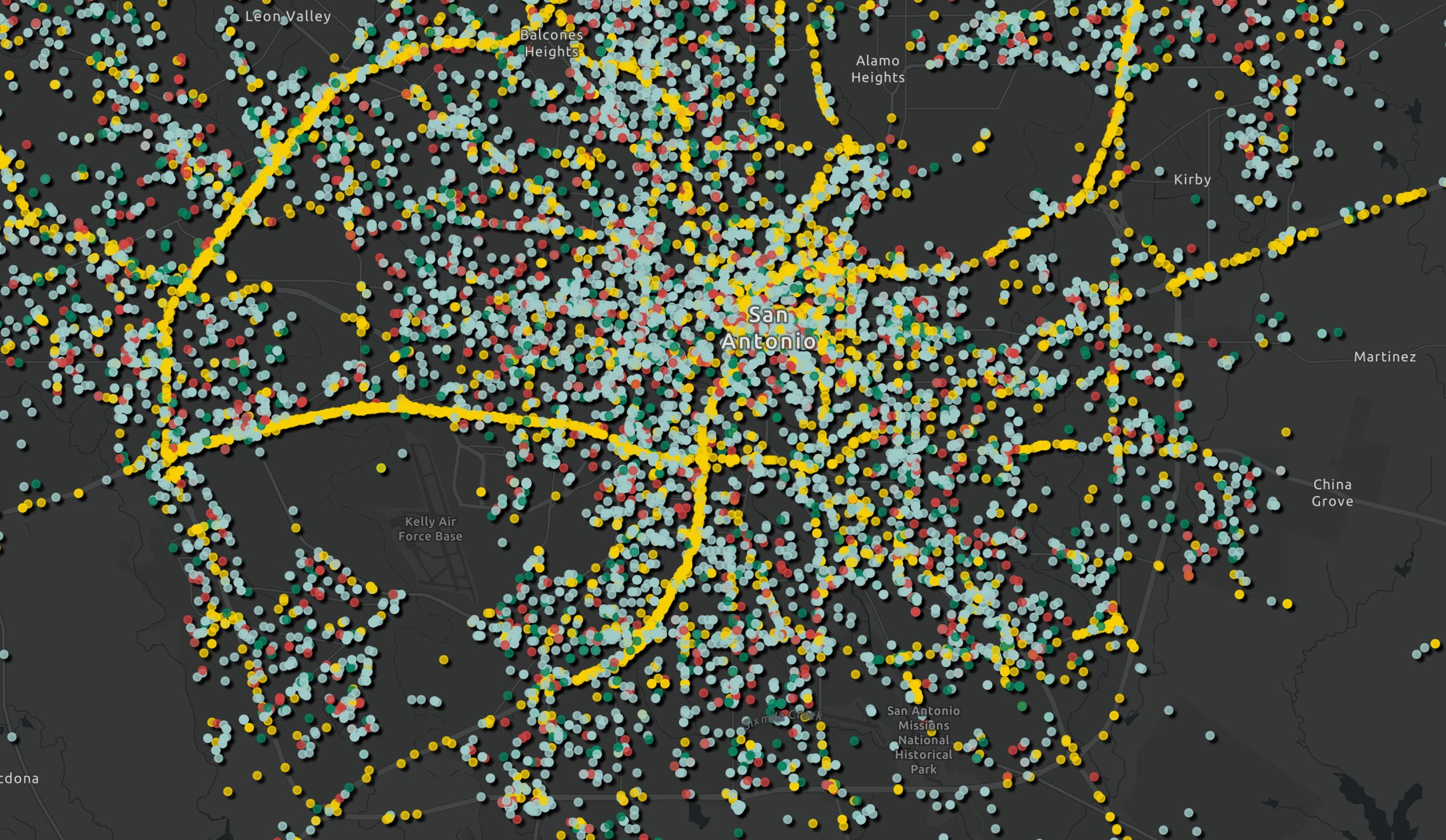
Data can be arranged to tell you almost anything you want to hear. Here are some numbers for San Antonio, pulled from our new data dashboard:
San Antonio is the most affordable city in its peer group, with prices five percent below the national average and more than seven points below the cities we compared. A typical home here costs around four times the median household income while the measured peer group is a little over five times median household income. We are consistently at the forefront of the last major American metros where a median family can buy a median house. Rents are also the lowest in the listed group of cities and our unemployment rate sits below the national one. Life expectancy is also above the peer average, and violent crime has fallen for the past two years. A sane, livable city. Book the parade!
But you can also make another argument. The median San Antonio household earned $13,245 less than households in peer cities, and the gap is not closing over time. Our poverty rate has run above the peer average for a decade and sits nearly 20 percent above it now. We are dead last in the share of adults with a bachelor’s degree among peer cities. Violent crime, though dropping, still runs 65 percent above the national rate. Obesity runs 17 percent above our peers, diabetes a third above. And San Antonians start new businesses at a rate lower than the vast majority of compared cities, twelfth of thirteen, ahead of only Phoenix. Cancel the parade. Convene the task force!
Every number in both paragraphs is public. So which story is real? That is the wrong question. The right one: without the data, how do you know what to think at all?
Without data, you only know what to feel, and what you feel about public questions tends to be decided for you by other people. Media statements and press releases highlight the optimistic framing. The honest numbers, which might paint a more accurate picture, are scattered across different government agencies and websites.
So, starting today, The Civic has a data dashboard, available at data.thecivic.com or by clicking the tab on our main page.
Each graphic is built from primary sources and every chart benchmarks San Antonio against a selection of peer cities so both the damning details and the flattering ones stand out. All sources are listed, the date of its data is public, and the feedback button goes right to our inbox.
Unfortunately, there is no public dashboard for most city issues. The numbers exist, but only inside the city departments themselves, and whether they ever come out is currently a matter of institutional generosity.
Go to data.sanantonio.gov, the official data portal of the “seventh-largest city” in America. It was launched (in beta) in 2018 and administered by city policy to this point, not by law. As of today it holds 162 datasets with the majority of them map layers. And unlike our dashboard, it’s basically a repository of data files that you have to parse through on your own. To the city’s credit, several files were updated as recently as yesterday, which means someone at the city is publishing similar metrics as we are, but nothing requires them to keep doing it.
For comparison, look at New York. In 2012 the city council there passed Local Law 11, which made open data a legal requirement. Every agency and every public dataset is available on one portal, over 2,400 datasets, with annual compliance plans filed every summer, and independent audits of three agencies a year… And a rule we particularly admire, requiring agencies to consider publishing, for everyone, any dataset they produce in answer to a records request. Great!
A decade ago New York’s portal already held more than a thousand datasets. And then, in 2024, their city council decided that the comprehensive public data was not enough and began issuing report cards of every city agency. Meanwhile, we need to decide whether 162 files, two-thirds of them maps, constitutes a real portal.
City staff is assembling the next budget right now and what it will look like is the question of the summer. Every department will present performance measures it selected for itself, in a document designed to justify its own funding. Council should demand two things on top of this: first, an open data ordinance with the same features New York requires. Second, an annual report on each department’s metrics and their spending, delivered to council and the public on a fixed date. New York has required exactly this, done three agencies at a time, twice a year for decades, a habit instituted shortly after the city nearly went broke.
Nothing would please us more than for our dashboard to be obsolete a year from now because the city made it redundant. San Antonio could decide to become the most transparent city in America with every department’s numbers published on a schedule, benchmarked against the same peer cities every year. No rival city offers that, which is precisely why it is an advantage for all of us; the business deciding where to expand or for the council member trying to govern on something more exact than an educated guess. And it is about to become a necessity. A fiscal crunch has hit City Hall and everyone knows it. To be responsible about what we spend, and what we cut, we need to know what is and isn’t working. So we built the free version, and the city should build the real one.
New York started decades ago—San Antonio should not wait any longer. No dashboard will tell you how to feel about the city, but it can tell you if what we are doing is working. Those are different questions, and the second one is more important.
This is awesome! A couple ideas on additional data that could be useful (especially for us over here at Strong Towns San Antonio).
1. Under public safety - how many transportation related crashes are occurring (cars, bikes, pedestrians, etc.). We have a vision zero plan and a vision zero team - the question is...is it working?
2. ADU (accessory dwellings) - a few years ago San Antonio changed the code to make building ADUs easier. Again the question is...is this working?